Bald designs loved designing the logo and creating a new refreshed brand identity for BrightHelm Financial.
We designed business cards, letterheads, folders and signage. We are at present working on a set of branded forms and legal documents.
Brighthelm Financial, offer holistic financial advice, specialising in bespoke mortgage and financial advice. https://www.brighthelmfinancial.co.uk/
Bald designs have worked with Love Your Hospital (LYH) and Brighton & Sussex University Hospital (BSUH) for many years now. We created their temporary joint branding, when it was announced that the charities were going to unite into a larger new charity.
Now that they have a new brand, my University Hospitals Sussex (myUHSx), it has been tasked to us to implement their new brand identity to all their marketing and promotional collateral.
The first was to create a 6 page leaflet introducing the charity as to how supporters and volunteers can engage with them.
We have gone on to design and create Bunting, Business cards, Large cheques, Fundraising packs, Gazebos, Legacy leaflet, Money boxes, Outdoor banners, Roller banners, Teardrops, Posters, Running tops, Staff clothing and more to come.
We have been working on their Brand identity book, which we will continue to update as we progress through creating their marketing and promotional materials.
Bald designs enjoyed designing the logo and creating a new brand identity for Daisy Goreham.
Business card designs were supplied to introduce her new brand to prospective clients.
Daisy Goreham Development offer tailored coaching and supportive guidance, helping you navigate your career path.
GWCA Solicitors provide legal services for individuals and businesses, with offices in Arundel, Broadwater, Goring, Hove, Lancing Rustington, Steyning and Worthing. Their new brand identity was launched in November 2022.
Bald designs were delighted to create GWCAs new brand identity. Designing their logo, stationery, pop ups and marketing collateral.
Consulting with Kerr specialises in the systems, processes and information that create and maintain value for business owners considering exits in a 3 to 5 year horizon.
Working with Lisa, bald designs created a rebrand of her identity. With a vibrant colour wheel provided by the client, we created a logo, visual identity, icon set, business cards and a leaflet.
All marketing collateral show the vibrant branded colour gradients with the strong typographical forms of her logo.
Bald designs were delighted to design a new brand identity for Paula Newton, owner of Bright Eye Business Consulting Services.
Bald designs have created brochures and leaflets for HD Tribe.
We designed the branded hoardings and signage outside of their Broadwater, Sompting and Storrington offices.
We design and produce a quarterly Puzzle magazine for HD Tribe, that is given free of charge to locally and to residents of care homes.
We continually design all the adverts for HD Tribe showcasing all the services that they offer.
Bald designs designed and produced a flyer for their Bereavement Counselling service and to tie in the design for a business card for their own Counsellor as well. Our design was based around the forget-me-not flower, for its colour and significance.
Previously we had designed a booklet for HD Tribe, that was small enough to fit into a jacket pocket, so their staff could present them to people, that required assistance with a funeral service.
HD Tribe are an independent family run Funeral Directors with nine offices covering most of West Sussex and they have a proven reputation for providing outstanding quality and service. This booklet gives a guide to who should be contacted and what services and help are available.
Stephen Rimmer pride themselves on their proactive approach and fast turnaround times, whilst still delivering clear and concise advice. Established in 1981, a lot of their growth has come from personal recommendation from their clients and business colleagues. They offer a full range of commercial and consumer legal services from their offices across South East Sussex.
Bald designs loved creating a fresh new identity for them, ensuring their continued advice will be able to many for the future.
Bald designs love working with Blue Light Group directors, Luke Brice and Sean Keelan on all of their projects.
We designed their website (created in Squarespace) and brochure, which both showcase each of the sectors that the Blue Light Group works in. The brochure design is a six page landscaped folder with multiple inserts and a slot on the flap for their business cards. We also provided a pdf version for sending to clients.
We helped strengthen the overall brand identity, with consistent styling through their colours, typography, imagery and graphics.
Bald Designs continues to work on brand identity projects for Worthing Gin. Our latest designs are for the Worthing Gin Marmalade, which are a great compliment to a fantastic range of products.
Since starting the project and working with our client Phil Duckett, we pushed the design through hoops to this final stamp design. Using the iconic Worthing Pier and the bright blue of the English Med, as our main colour, like the gin itself, we created a crisp, fresh timeless design.
In September 2019 the original blue bottle with Rosemary infused gin was launched, and since then two new flavours have been added. Keeping the brand identity the same, we added orange to the colour palette, to introduce the Orange Blush infused gin and green for the Mellow Pear infused gin.
We are constantly updating the adverts to tie in with the new products and marketing campaigns.
Embrace Finance is a non-profit social enterprise working with grant-makers, registered charities and social enterprises to build financial confidence and financial resilience.
Bald Designs were approached by Liz Pepler, Founder and Director, to quote on rebranding her company. With Liz working in London and Bald Designs based in Worthing, the approach is always the same for us.
The most important part of the design process is the initial meeting, discovering what is liked by the client and what is not. Discussing where the original brand identity came from, why it was chosen and what is needed to go forward. For Liz it was the venn diagram, for us it was scaling back the amount of colours in the original logo, choosing the right font and ensuring the overall brand identity and logo represented all that her company has to offer.
I was delighted that the font chosen was Neue Kabel as I love the cut by Marc Schütz of Rudolf Koch’s 1927 design. The clean modern lines and distinctive letters, like on the ‘a’, ‘b’ and ‘g’ add strength to the type for this brand.
Bald designs designed a logo and created a new brand identity for Leigh Otterson-Walters’ new venture, Working Mums & Dads.
In 2012, Working Mums & Dads began life as an online community support service in Worthing. Now in its 8th year, with over 20,000 impressions each month, the community represents over 10% (nearly 14,00 members) of the population of Worthing.
Now working with local businesses to actively promote them through social media and direct maketing channels.
David Hurley is a Sports, Massage and Acupuncture Therapist based in Worthing, West Sussex.
Bald Designs were asked to refresh the brand identity for Future Focus (original company name) by its owner David Hurley. David was very keen to keep the graphics and colours already within his brand identity.
The main emphasis of our design was to make David Hurley typography stand out and incorporate the graphics within his logo.
David Hurley has now clean lines, a calmer colour palette, by toning down the original blue and red, modern typography and cleaner graphics.
Bald Designs are in the third year of designing and producing Love Your Hospitals Annual Report. We continue to deliver cost effective and great designs to enable people to learn about their organisation, financial accounts and to showcase the trusts work and that of their many supporters.
Bald designs enjoyed refreshing Inspirational Interiors logo and brand identity. Working with owner and interior designer Claire Duncan and utilising Squarespace, we designed and updated her website to be more in keeping with the standard of work she offers to her own clients. We set up a gallery of her most recent work, to allow potential clients to be able to see the variety of projects Claire works on.
We also implemented her new brand identity across her letterhead, compliment slips and business cards. Updating layouts, typography and colour.
Bald designs loved designing a new logo, part of Love Your Hospitals brand identity family and launch materials for the First 50 Club which was held at Rolls Royce. We also designed the application flyer, posters and exhibition stand.
Love Your Hospital will give each company £50. In return, their staff will commit to finding ingenious and fun ways to make that money grow for a wonderful cause! The challenge will start in October 2019 and runs until February 2020. The First Fifty Club is a unique opportunity for local companies encouraging, Team Building, Staff Development, Corporate Social Responsibility and the chance to Support a Local Charity
Bald designs enjoy working with such a great local charity and we are equally proud of our designs and their work in supporting Western Sussex Hospitals.
Haven Power asked us to design a report for the market research that they commissioned from Vanson Bourne. The report was an independent study of how SMEs are feeling about energy suppliers across the UK.
We designed and produced a 12 page report, with an emphasis on using graphics to convey the message in a clear and concise way.
bald designs have been working with Elementis for a few years, designing and creating leaflets, flyers and posters for their England and American offices. In November we created a leaflet in five languages on information about GDPR for their staff.
Last year Bald designs were asked to create a new brand identity for Mackley Industrial Estate. Working with Sam and James Mackley we produced a new logo suite incorporating all logo formats for print and online, as well as a Brand Guidelines book explaining their brand identity usage, typography, colour breakdown and logo parameters.
We have designed letterheads, complimentary slips and business cards and are in the process of designing and updating all the sites signage at the Mackley Industrial Estate in Small Dole.
Bald Designs latest designs for SRU was to update their banners on their website, utilising their brand colour palette to create eye catching offers. The jpegs were also supplied to the client for use on LinkedIn and other social media platforms.
We were asked to design a product catalogue by SRU Insulation to enable them to attract new customers. Our service also included briefing the photographer and liaising with the printer to produce an effective sales tool on time and on budget.
Worthing based WANNADO Street Dance required a logo and brand identity to help them stand out in a busy marketplace.
Working with Kerry, the Owner and Dancing Instructor of WANNADO Street Dance, we chose a design that represented the lively, fun and friendly experience that the kids get from attending her classes.
We have provided a range of designs for leaflets, tshirts, business cards and marketing materials to get her noticed and to ensure busy classes for her workshops.
More recently we have updated her graphic mark on her logo and produced posters for crew auditions. a foamex board for promotional days and posters and adverts for the launch of her Spring Hip Hop boot camp.
Love Your Hospital is the dedicated charity for Western Sussex Hospitals NHS Foundation Trust.
At Bald Designs we designed a Newsletter that gives an insight into the amazing work that Love Your Hospital does, showing fundraising updates, supporters news and reviews, along side information about where the money is spent and how you can continue to donate and help such a worthy cause. As well as the 12 page booklet we designed a letterhead for this mailing.
Bald designs had the pleasure in working with Nevalee Business Solutions to create a new brand identity for their company.
Nevalee are experts at delivering solutions for complex of challenges and guide and support their clients by safeguarding their systems to give their clients’ businesses a leading advantage.
Bald designs also rebranded RedAtlas, an Airport management system and a key product of Nevalee Business Solutions.
The ITF holds a Worldwide Coaches Conference every two years and in 2015 their event was in Turkey.
Initially designing and providing web banners for their Conference website and emails and then was asked to design the splash screen, icons and headers for their Event App.
We also provided collateral materials for their event, such as name badges, posters, PowerPoint templates for presentations and pull up banners.
HR Works has a passion for people and thrives on working with business leaders to get the very best out of their biggest and most expensive asset – their people!
Bald Designs refreshed HR Works logo and brand identity.
We designed their website to be more user-friendly and performance focused and designed a brochure to match the new style making use of the colour range within their logo. Ensuring all the marketing materials and documents are on brand.
The icons for this site were designed by Christian Faes, who was on work experience with Bald Designs during June 2019. Christian studies Graphic Design at Istituto Sacro Cuore www.istitutosacrocuore.it
Bald designs loved creating the logo, brand identity and launch materials for Love Your Hospital lottery. We designed the application flyer, posters, online banners and exhibition stand.
Bald designs enjoy working with such a great local charity and we are equally proud of our designs and their work in supporting Western Sussex Hospitals.
Love Your Hospital is the dedicated charity for Western Sussex Hospitals NHS Foundation Trust. They support hospital projects which fall outside of core NHS funding and show a clear and direct benefit to patients.
At Bald Designs we created Love Your Hospitals’ Halloween Firewalk materials. We designed their posters, flyers, application form, outside banner and online banners.
Bald designs rebranded RSOPA – Performing Arts. Working with Courtney and Amelia in choosing the best design that portrayed all their strengths, skills and energy.
RSOPA provide dance, drama, singing and performing arts to a wide Worthing audience, with a team of outstanding teachers and professionals who are focussed on individuality.
Bald Designs have designed a new logo and created mini brand guidelines for personal travel expert, Kicki Smith. We recently updated her social media icons and continue the process of implementing the new design through her business cards and other printing collateral.
Bald designs enjoyed designing this brochure pack for W Welch estate agents and for refreshing their brand identity. Taking inspiration from the triangle shapes in the counterspacing of the ”w”. We helped create a fresh design for a great Worthing company.
Love Your Hospital is the dedicated charity for Western Sussex Hospitals NHS Foundation Trust. Every year, they invest more than £1,000,000 to help ensure patients, visitors and staff at St Richard’s, Worthing and Southlands Hospitals have the best possible experience and that their staff work in a healthy, safe and inspiring environment providing first-class patient care. They support hospital projects which fall outside of core NHS funding and show a clear and direct benefit to patients.
At Bald Designs we created a leaflet that gave an insight into the marvellous work that Love Your Hospital does, showing testimonials along side information about where the money is spent and how you can continue to donate and help such a worthy cause.
On our continuing work with Love Your Hospital, bald designs have designed and created lift wraps and collection tins to help promote their brilliant work.
Bald designs had the pleasure in designing a new brand identity for Illuminate Therapy. We worked with Kay Bradley in producing her new logos for print, screen, mini guidelines and her first marketing material, her business card.
We created a logo for business start-up EyeFind, who are an internet based import and export company. Launching in 2017, with a website to follow later in the year.
The branding was applied to their letterhead, compliment slip and business card.
At Bald Designs we designed a leaflet that showed the beautiful jewellery that Orla James creates from their Worthing based family run premises, in Broadwater.
Showing that not only can you buy your wedding jewellery at their shop or online but you can also make your own bespoke wedding bands on the premises.
We also designed two pop up banners that reflect the leaflet design and continues to show their visual brand identity of bespoke quality jewellery.
The International Tennis Federation (ITF) needed to update their Play Tennis Manual. The first edition was 50 pages, mainly black and white and with outdated tennis illustrations and diagrams.
This second edition, designed and produced by bald designs, is colourful and informative, easy to navigate through the 166 pages and updated with all the latest rules and regulations, photographs replacing old illustrations, clean graphs and infographics for ease of use.
The Play Tennis Manual is a valuable resource that provides a practical teaching methodology that will support tennis coaches starting on their coach education pathway through the ITF Play Tennis course. It is also a go-to-guide for those tennis coaches looking for more information as to how to better introduce tennis to their beginner players worldwide and to help them learn to play the game in a fun and efficient way.
This printed document is available as an e-book and translations into Spanish, French and Chinese are due mid year.
We were asked to design a logo, marketing material and website for cutler, Deon De Bruyn.
The logo was created and is now used as his Makers Mark Stamp on all his knives and sheaths. The rich and warm colours from Deons’ first Padauk wood knife scale (handle) was used as the background for his stationery and marketing materials.
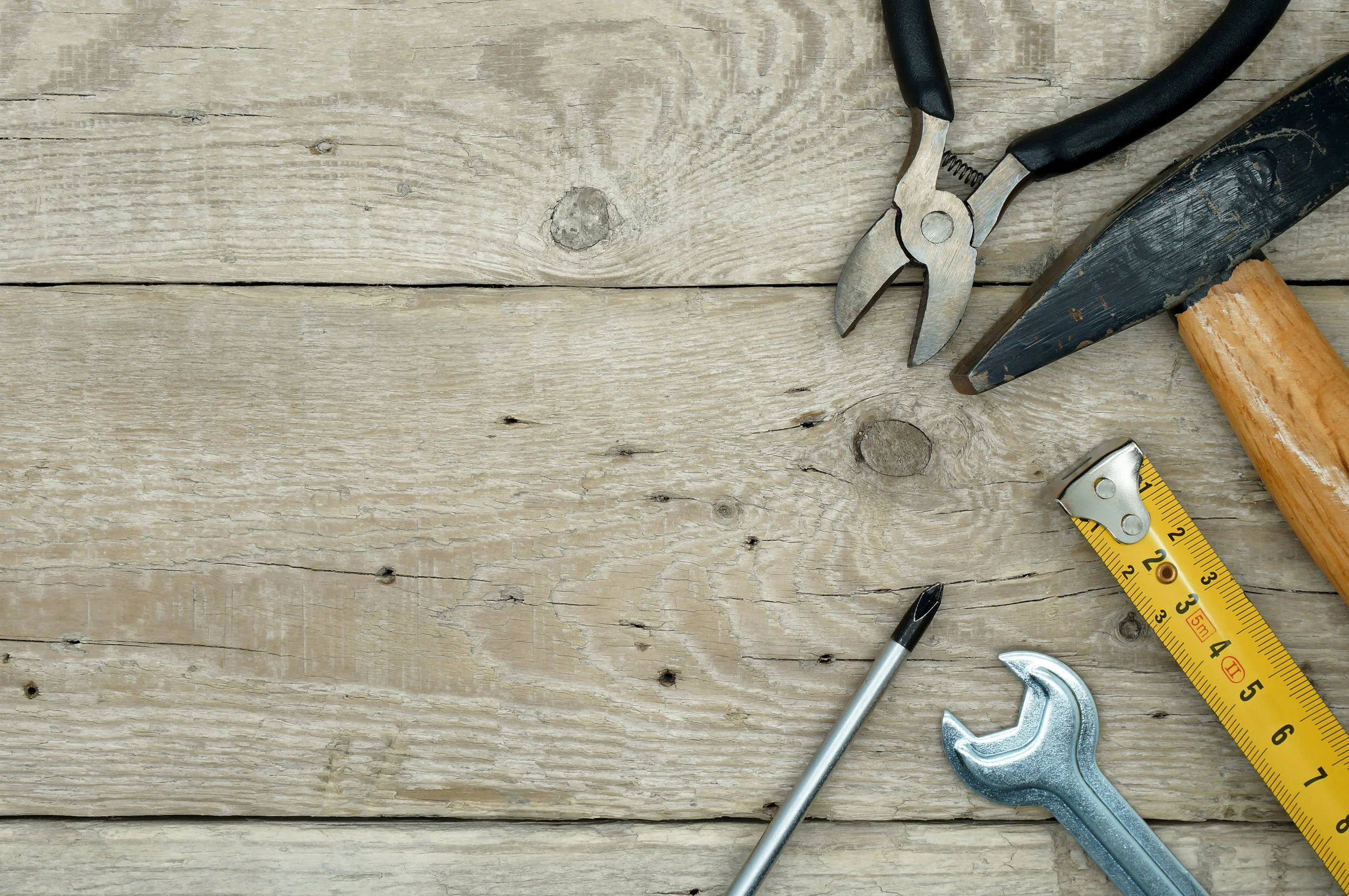
Creation of logo and design of business cards, flyers and removable magnetic signs for a local handyman.
The use of bright colours, typography and clean imagery helped this company stand out and show a level of professionalism above their competitors.
Westcroft Judo Club introduced a programme of events for which we were asked to design and print a Grading booklet and Certificates.
The purpose of these items were to increase and reward participation for the Judokas and, in so doing, increase revenue for the club.
After winning a pitch, our brief was to create the logo and brand guidelines for the Global Schistosomiasis Alliance.
These guidelines have been developed to ensure consistent branding across all GSA materials. They include information on the use of design, the logo, the colour palette and typography when developing professional communications materials for the GSA.
The design element is an expanded version of the wave in the logo. It serves to increase the visual impact of the logo’s graphic element and is intended for use on less formal, more marketing-based communication pieces and various other branding purposes.
A graphic element builds recognition and guides the placement of images, typography, visual hierarchy and colour schemes. It can also work as decoration in cases where there are no images.
GSA aims to support the goal of the World Health Organization (WHO) to eliminate the tropical worm disease schistosomiasis world-wide.
GSA founding partners include among others the Bill and Melinda Gates Foundation, the Schistosomiasis Control Initiative, the United States Agency for International Development, Merck, and World Vision International.
http://eliminateschisto.org/
We were engaged to create a logo and brand guidelines to reflect the strength and unity of the National Alliance to End FGM (Female Genital Mutilation) and ECM (Ending Child Marriage).
The brand is intended to unify the Alliance’s many members under one common banner. A cohesive brand identity is crucial to the Alliance’s success – it helps both members and the public see the Alliance as a force for change, as an organised body with a clear, strategic goal.
The graphic element has been developed for use within materials and as a background application. The braid is a crucial element that always appears on every piece of communication and can be used to house photography. The colours reflect the Ethiopian flag, rooting the National Alliance to End FGM and ECM in the culture and history of Ethiopia.
We have designed the new logo for the Worthing Blues Festival that will be used on all their marketing materials.
The logo has now been incorporated in to the 1950s style poster that we designed earlier in the year, for the Worthing Blues Festival, which takes place on the 12 August 2017.
Bald Designs designed and produced a brochure and exhibition display for Pindar Creative, to raise awareness of all the services that they provide.